Instapaper Gripes
Posted on
First let me say that I really like Instapaper. It was one of the first apps that gave my iPad real purpose, and I use it pretty much daily. While the comments below might be negative and trite, there are tons of great things to love about this app too, so don’t take things too seriously. If you aren’t already using Instapaper, I’d recommend reading the the MacStories review to see what Instapaper is all about.
A lot of these gripes are based on personal usage (described early in gripe 1) that, in theory, mirror large scale usage. I’ll be the first to say that I could be way off on that. I’m not currently aware of whether Marco captures the kind of usage data that would help him evaluate the effectiveness of the Instapaper user interface, or if he has ever made those numbers public.
The big idea here isn’t to gripe on the Instapaper app for the sake of griping, but I want to start discussing interface design, the tradeoffs we make, how design evolves, and so on. I figured this post would be a good place to start, since I am unhappy with some of the choices made in Instapaper, despite the fact that it is a really good product.
Aside: Gripes, while numbered, are not sorted by importance.
Gripe 1: Always showing the collection chooser is a waste of space.
When you first launch Instapaper, you’ll be taken to the Read Later collection. Before I talk about that collection, let’s talk about overall layout and navigation.
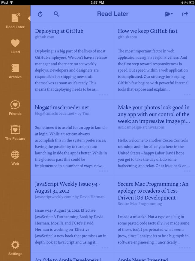
This view tries to accomplish two things at once. First, it’s a collection chooser (overlaid in orange), which lets you switch the collection you are currently browsing. Second, it’s a collection browser (overlaid in blue), which lets you browse the articles of the selected collection and load an article to read.
I’ll take a stab in the dark and say that I am an average Instapaper user. My Instapaper usage is as follows…
Each week I’ll see various articles on the web shared to me via Twitter or mentioned in email. I’ll mark them as Read Later using my desktop browser’s bookmarklet or the built-in Send to Instapaper features of apps like TweetBot. I probably send anywhere from 15 to 25 articles to Instapaper a week. When I do find some time on the couch to read, I’ll open up Instapaper on my iPad. The collection I’ll be browsing is always the Read Later collection. I have to imagine this is the same for most others as well.
If this is true, and the majority of the user’s time is spent in the Read Later collection, I cannot understand why the interface has been designed to dedicate 15% of the screen to collection choosing, which is not something that is common in typical use. I feel like giving this space back to the collection browser, along with some ideas on improving the preview cells of articles, could greatly improve the browsing experience on Instapaper.
Coincidentally, TweetBot for iPad has a similar, always present, sidebar, but here it doesn’t bother me nearly as much, since I do frequently use it to switch collection contexts. With Instapaper, the collection chooser is, for the most part, just dead space for me.
Gripe 2: Centering the title in the collection browser looks misaligned because of the system clock.
Can not be unseen.

And, yes the TweetBot screen has the same problem.
Gripe 3: The “grid” default collection layout style is questionable.
I know there are many popular grid-oriented apps out there for presenting content on iPad. For me, I find the use of the grid in Instapaper to be more of a distraction than anything. I don’t like the flow of my eye path as I have to browse the collection in a grid.
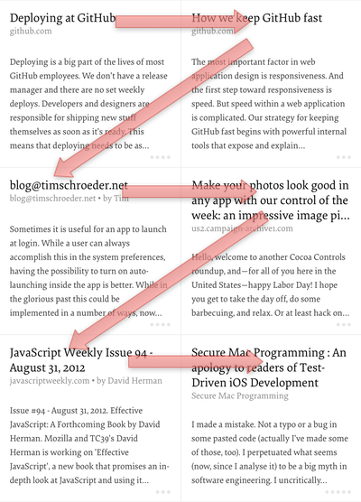
I’d much prefer a purely stacked list of article previews. I feel that this eye flow is better, and, as a bonus, it has great synergy with the vertical scrolling motion.
Thankfully, there is an option to toggle this behavior in Settings. I don’t think it was there immediately upon 4.0’s release, as I vividly remember not liking the grid and not seeing a way to turn it off, but sure enough, I found it while I was prepping this article. Woot!
Aside: The launch image always assumes a grid so on a fresh launch it looks a little clunky to see the grid and then see it go away in favor of the users preference. It’d be nice if the launch image were made more user preference neutral in the future.
Gripe 4: Different collections should have different preview cells.
There are many different collections, but only one basic cell design for the article preview cell. I find this unfortunate because the user’s goals when exploring the different collections are quite varied and could benefit greatly from expanding the different cell preview designs. It would be great if Instapaper could offer some user preferences to suit their needs. Some examples:
Preview Cell Design for “Read Later”
Scenario: I’m browsing the Read Later collection from my couch. I have an hour to kill and want to catch up on things. The sort of the Read Later collection is based on when I added articles, so I’ll see the most recent at the top. My goals for this view are:
- to remind myself about the article I added
- to determine whether I want to read it now
To remind myself, the preview cell offers a mix of article title, source domain, author, and a short blurb. For me, the blurb is usually overkill. It could be subbed out for more useful information.
While very helpful in reminding me about an article, the preview cell does very little to help me determine whether I should read one article or another. The cell does provide a series of dots which, if you use Instapaper over time, you might come to realize represents the length of time that the article will take to read, and how much of it you have already read. Personally, I’d like to see that changed into a more descriptive, text-based description and drop the “percent of article read” feature. After all, to do it in text would be verbose, and I’d like to think that the majority of users read these web articles in one sitting (again, I don’t have numbers on this).
What I’d really like to see is Instapaper start to take advantage of the friends I’ve added to it and the global data it has, in order to help me realize what of the things I’m browsing is worth my limited time. Which articles have been liked by my friends (show me a few of their tiny little avatars) and what articles are making an impact globally (using global read and liked counts)?
Preview Cell Design for “Liked”
Scenario: I would assume that one of the main reasons I’d be in the Liked collection is because I’m trying to find an article I’ve read and Liked previously. I probably want to reference it myself or send it off to a friend. For me, this would usually involve searching, but I’m going to wait to talk about that later. As for the preview cell design, again we see the same design used in Read Later. How to improve?
In a word, dates. If used often, the “Liked” collection will span months and months of articles. Knowing when an article was published and when I Liked it would help me find what I’m looking for during a browsing session.
Preview Cell Design for “Archive”
I feel like the design for the preview cell in the Archive collection should be a hybrid of my proposed Read Later and Liked preview cell designs.
I also think that the Archive collection (as well as maybe Liked) might do something to help group up articles I’ve read by the same author or from the same site.
Preview Cell Design for “Friends”
More than improvements to the the preview cell, what this collection really needs is a list of my friends. Show me who is actively reading and linking stuff. Let me browse their history, as a collective or as individuals. (I go on about this in more detail in gripe 9).
Gripe 5: Archives and Liked collections should load more articles as necessary.
For what are probably many valid reasons, Instapaper only loads a small portion of your Archive and Liked collections. When you browse to the bottom of these collections, it just stops. If you want to load more, you need to visit settings and tell Instapaper to load more articles for these collections. This seems clunky and non-intuitive to me. There is nothing at the bottom of the list to even suggest that you should go to Settings in order to see more articles.
What I’d prefer to see here is some sort of button that allows users to manually load more articles, or perhaps Instapaper should passively load more by making an endless scrolling list.
Gripe 6: Respect my eye line.
The article view does a great job of letting the content own the space. There is a navigation bar, but unless you interact with it, it will eventually fade away while you read.
There are two ways to bring the bar back. One is by tapping somewhere that isn’t otherwise interactive. The other is by scrolling to the bottom of the article — this is my gripe.
When I read articles in Instapaper, my eye line or reading zone (shown below overlaid in blue) is the very top of the screen. I literally read 1-3 lines and slowly scroll the page up little by little when I’m reading an article.
Eventually, I’ll be almost done reading the article and — BAM — the navigation bar comes up and covers my reading zone. What follows is an unpleasant scrolling dance that I don’t even want to describe.
I understand that it makes sense to automatically show the navigation bar towards the end of the article, but the algorithm needs to be tweaked in order to make sure that the reading zone of the user would never be hidden by the navigation bar, which, from my experience, it clearly can.
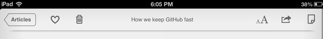
Gripe 7: Questionable archive icon and popover menus.
When you finish reading an article, part of the reason the navigation bar comes back up is because you have an action to perform:
- Like the article by tapping the heart icon.
- Archive the article by tapping the trash can and choosing “Move to Archive”.
- Delete the article by tapping the trash can and choosing “Delete”.
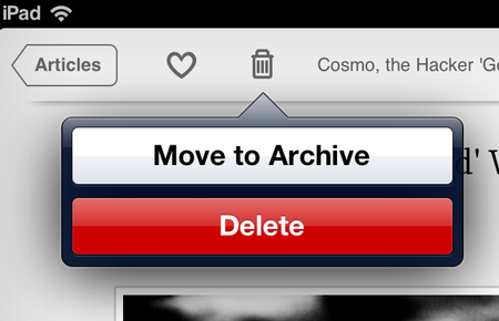
I feel like the choice of a trash can for the non-destructive action of moving an article from my Read Later collection to the Archive collection is unfortunate and likely confusing to some new users. Trash cans in a computer context mean “I never want to see this file or object again.” A trash can is not a suitable icon for transferring an article, even if the destination is an archive. Ultimately I feel like each of these three actions should have their own icon and remove the popover entierly.
Aside: One alternate way this plays out is if you Like an article first and then tap the trash can the Delete action is removed leaving only Archive. Why would you ever want to present a popover menu where there is only one action? Again my recommendation would be to drop the popover entirely but should a case like this come up just assume the one remaining action and suppress the popover.
Gripe 8: Search is too elementary.
Search in Instapaper works like this: there are various search buttons in the app, and when you tap on them a modal window pops up. Then you type in some terms and a search is done against the full text of all the articles you have in Instapaper. The search happens on Instapaper’s web servers. The results are presented in a list and then, upon tapping an item in the list, you jump to another modal window with the webpage of the article.
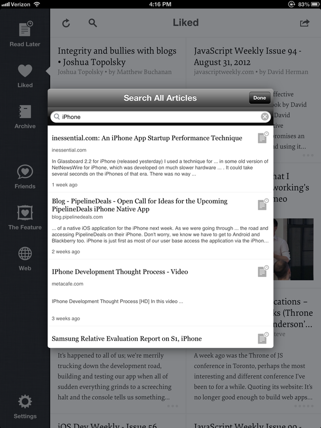
There are many problems with this experience:
- Search requires an internet connection. There is no way to simply search the stuff you have locally.
- In order to accept the search terms and present a result list, Instapaper uses a modal view that fills only 50% of the screen. Half the screen is left underutilized. Why is this not happening inline in the collection browser area, as I would have expected?
- There is no way to control your search context. The only option is “All.” For example, you cannot do a search for something in your Liked collection.
- There is no way to reorder the results; they are presented in an unknown order. There is no way to sort specifically by the liked on date or search term relevance.
- When interacting with a result, the article is presented in a modal webview instead of the expected Instapaper article view. One of the major points of Instapaper is that it filters out a website’s frame for easier article reading. Why not a proper article view here?
Overall search comes off as a minimum viable shipping feature, good enough to ship, but not where it should be. If it were just a young feature that would see improvement over time, I wouldn’t gripe as much, but search is actually the main unlock if you choose to pay extra for a monthly Instapaper subscription. In that context, I really think it’s important that search sees improvements soon. I don’t think it’s right to reward subscription buyers with such an elementary feature.
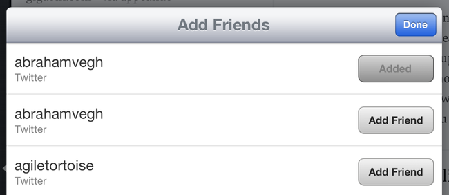
Gripe 9: The friends collection
Another young and hopefully to-be-improved-upon feature is the social aspect of Instapaper. The current version allows you to connect various friends, but the interface can be pretty clunky at times. For example, you have to add friends with one view and then remove them with another. Why does this require two views?
However, the real problem is the collection browser itself.
As I’ve said before, I really think this view needs to include the avatars of the people who are sending me this content. I know people by their avatar a lot better than by their twitter handle, and this change would make visually browsing things much faster. Also, I want the power to isolate a friend and just see what he or she is promoting. Let me browse by my friends, and then browse what they are sharing specifically.
At the bottom of the Friends collection is a toggle to show “Shared Links” or “Liked by Friends.” First off, it’s really awkward to have a toggle between a noun and a verb. Something is amiss.
What does Instapaper mean by “Shared Links” — these objects are called articles everywhere else in the app — why the difference here? Best I can tell, “Shared Links” represents URLs that people have posted on Twitter, Facebook, Tumblr, and other services. I get that there is a naming challenge here, but I am not really happy with the current solution of “Shared Links.”
In fact, I truly wonder if there is any value in having two distinct sub-collections in the friends category. Why not just one collection, and make it clear in the preview cell how this article came to the reader, i.e.: “Liked on Instapaper by Manton Reece @manton” or “Posted to Twitter by Thomas Fuchs @thomasfuchs?”
I think this, plus the power to browse and isolate content per friend, would be a nice improvement.
Gripe 10: Drop “The Feature” collection.
Described at the top of its view, The Feature is:
Daily editorial selections from the finest articles saved with Instapaper.
I never use this feature/collection. I have enough content to fill my reading time, and the idea of reaching out to this specific collection of content seems strange.
It’s unclear how many articles are posted per day. The blurb says “editorial selections” as if to say, “these aren’t selected by robots,” but then no human editor names appear either. Who is the editor? What makes these articles so “fine?” What is the focus here?
When I click on an article, it doesn’t even load a standard Instapaper article view. Instead, it loads the website. Why would it do this? For me, Instapaper is about an offline, clutter-free reading environment. This provides neither. It feels like an ad.
Maybe I wouldn’t gripe as much if this collection didn’t stare me down every time I opened the app. It just sits there in the static collection chooser area, which I never use. I wish I could turn it off.
Gripe 11: Settings
When I tap Settings in the lower left corner, I get a popover that is about 1/3 the height of the inner view (thus I need to scroll to see everything). Every other navigation-based item in this app has made use of the full screen of the iPad. If Instapaper didn’t have an iPhone version, is this how the Settings view would have been designed? I doubt it.
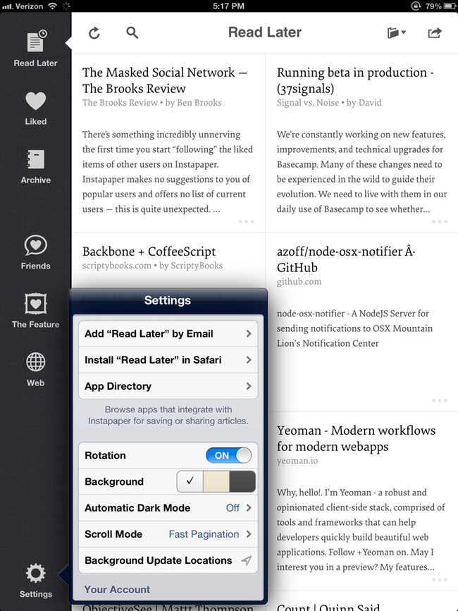
The Settings view should fill the screen and fit in with the visual style of everything else, probably as a collection browser if the static collection switcher style design is staying. With this extra space, you can be more specific about things, like using labels as well as icons for the various friend services.
Gripe 12: Android
First I want to say thanks to Instapaper for doing an Android version. It was very handy to have a portable tablet version of Instapaper around when iOS 6 bugs were making my iPad less than useful. I will gripe however, that on Android you are not always following along with the Android-isms. For example, I found the behavior of the hardware back button to be somewhat inconsistent. Android apps should feel like Android, and iOS apps should feel like iOS.
The biggest problem with the current Android version is the lack of scroll position saving during orientation switches, which for me are usually involuntary as I move my Nexus 7 to reach for a glass of water or something. I’ll come back and my article is not where I was. Very frustrating.
On Gripes
Again I’ll say that I really do like Instapaper, both the service and the apps overall. My gripes are meant as feedback and kickoffs for other user interface discussions. Please do not take offense.